Thursday, 25 October 2012
Tuesday, 9 October 2012
Experimentations
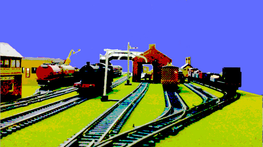
This is my first experiment. This started as a screenshot of a film that I had created of my model railway layout:

The obvious problems being the arms controlling the trains, and a very messy looking background, I took care to remove the background:

Next, I decided to take away some of the detail in the picture, by adding "Posterise" effect:

Finally deciding on the posterise levels, I duplicated the layer four times, and adjusted the hue differently in each layer to come up with as best as I could, a simple foundation for the image:

After that, I adjusted the levels of the picture to take away the harsh colours of the changed hues:


Settling for a nice, green/yellow beach looking colour, I finally changed the background to a washed out sky blue:

The image below was a re-revised image when I realised there was a tiny bit of the background behind the crane near the signal box.

Here are some attempts at a good black and white picture:

The final picture:
This is my second experimentation:
This shot is of an Arriva Cross Country 4 car 220 Voyager stopped at the signal (out of shot).
The train is a 00 gauge model.

Firstly, to get rid of the background, and because I didn't transfer the image to the computer straight away, I used a free app on my iPhone 4, called "Glow Draw". I adjusted the brush size to maximum, and selected white. I then very carefully painted around the train to remove most of the background. That done, I saved the image to my Camera Roll.

Next, I opened the image with another app called "PS Express" (Adobe Photoshop Express):

With the image loaded, I added "Sketch" effect which is the equivalent of "Posterize" I put the strength to 31. This eliminated any major detail in the train, but the "X" logo of Cross Country is still visible, which is the effect I wanted to achieve:

I brought the Exposure up to the maximum, to make the colours of the train stand out more, as well as make it look more like a cartoon image:

I brought the contrast up to about 26 to stylishly fade the end of the train into the horizon, as Photoshop Express does not have customisable fade. Notice the underside of the train stands out more:

I added "Sharpen" to about 30. This lost the noticeable darker shade on the front, and brought the "X" out more:

Lastly, I used a very good effect: "Rainbow"

This is the final image save:

In the standard photo viewing app, I used crop to cut out the unnecessary rail, and bring the train closer to the front:

The next idea I had was based on the recent purchase of a Mayne bus model. Due to sensible buying, I usually study the models with great care, so I can say that this company are from Clayton, Manchester. They operate around the Pennines, and southern routes from Manchester. This one in particularly shows the route of 235 bound for Mossley via Brookbottom. As I purchased this model for it's depot whereabouts and not it's route number, it is currently running from Manchester to Birmingham. This poster shows the reverse journey, and the next one is to Manchester.


Originally, I had not intended to create the advert, and had just settled for a professional photography look to show to people:

The image above was done by using 3 sheets of A4 plain paper, a table, and the white wall behind.
First, I added the base effect for all of my posters: Thresh hold. This adjusted the black and white coverage so that the Mayne text was still readable. I then replaced the white with a 60's cream colour. That done, I cut out the cream colour from the windows using the Magic Wand tool, and set a 60's sky blue colour for the background. I merged the colours, and then cut out the the cream colour from the front using the same technique. I replaced the colour with a washed out red, cut out the entire bus from the cream, deleted the cream outside the bus, and put the text in. From experience, the pun is usually the most catchy part of the advert, therefore taking the Mayne road would suggest someone saying they spelt "main" wrong, it is emphasised by being in capitals, on the Manchester advert, it is a literation, with the clever word play it suggests it is something to do with travel, and it goes to Manchester:
The next advert I had to search high and low for an excuse to create. Eventually I found the correct deal, and used an unsuspecting photo that had just been taken to show a long train:

(170504 waits to depart for Birmingham New Street from Shrewsbury platform 6)
firstly, I duplicated the layer, hide the original layer and then put extensive Thresh hold effect on, in a curious attempt to try a new approach:

I changed the black colour to a dark green to symbolise one of London Midland's colours, and the white to a washed out blue: My sky trademark for posters:

I then added a softer thresh hold to the second layer, hiding the first layer for the time being:

This time, I replaced the black with a dark blue, and the white with a 60's cream:

I turned the second layer on, put it behind this layer, and changed this layer mode to
"Linear Dodge (Add)":

I then added three layers of text, with the price to look like it had been painted on the platform:

When I looked at the final design showing the price, I had another idea to show the train as the "1" and then a big "3". While looking for the train that would fit this description, I stumbled upon the idea that a train almost headed straight for the camera looked like an "0", so I selected a 350 Desiro that did just that:

I took the train out using the pentagon select tool, and put it onto a different layer, I then added thresh hold, replaced the black with the same dark green as used in the first poster for London Midland, and the white with a washed out yellow, and cut out the end to make it look like it was exiting a tunnel:

I then added the appropriate text for the train to be coming out of on two layers:
one was for the behind text, and the 0 was cut halfway to overlap the train:

I then added a black background to make the price and train stand out, also adding the headline:

Finally, I added the "London Midland" small text:

Subscribe to:
Posts (Atom)